
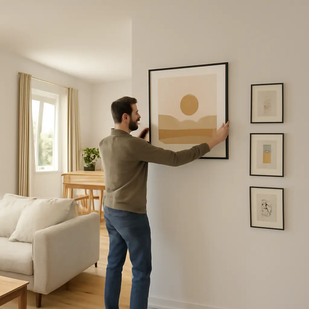
Making Art Work in Tight Spaces and Open Layouts
Art placement is the thoughtful selection and arrangement of artwork in relation to a room’s dimensions, sightlines, lighting, and furnishings. In tight spaces and open layouts, the goal is not simply to fill blank walls: it is to give art enough visual presence without crowding a small room or letting it disappear in a large one. The Metropolitan Museum of Art’s guidance on hanging works emphasizes viewing art at eye level, while the U.S. Census Bureau reports that the median size of a new single-family home was 2,233 square feet in 2023—a reminder that homes vary widely, and usable wall space can be more limiting than total floor area. By sizing works to their surroundings, grouping them with clear margins, and using art to connect or distinguish zones, homeowners can make artwork feel intentional in either setting.
Art placement and spatial scale
Art placement describes how artwork is positioned and sized in relation to architectural features and the objects around it. Interior design guidance commonly treats the wall, furniture, and artwork as a visual unit: a piece should relate to the space beneath it rather than float independently. A familiar starting point is to hang the center of a work at roughly 57 to 60 inches from the floor, near typical standing eye level. This is a guideline rather than a rule; seating, ceiling height, and the intended viewing position can call for adjustments.
Scale is the first decision, but it leads naturally to two related choices: whether to use one work or a group, and how art should respond to the room’s layout.
Proportion over a sofa, console, or bed
Proportion is the visual relationship between artwork and the furniture or wall it accompanies. A commonly used decorating guideline is to choose a work or combined arrangement around two-thirds the width of the furniture below it. For example, over a 90-inch sofa, an arrangement about 60 inches wide can feel balanced. Treat that ratio as a practical starting point, not a measured standard: a taller, narrower work or a deliberately oversized piece may suit the room better.
Keep the artwork close enough to feel connected to the furniture, often with about 6 to 10 inches between the furniture’s top and the frame’s bottom. In compact rooms, this relationship helps prevent a small picture from looking stranded high on a large wall. In open rooms, a suitably broad piece can hold its own against a sofa and help establish a focal point.
Single works, pairs, and gallery walls
A gallery wall is a coordinated arrangement of multiple framed works treated as one visual composition. It can make use of smaller pieces when a single large work would be impractical, but the overall grouping—not each frame separately—should be sized to the wall or furniture. A useful approach is to lay the arrangement out on the floor or make paper templates before drilling.
In a narrow room, a compact grouping with consistent spacing can add interest without spreading across every available surface. In an open layout, a larger, more generous grouping can create a focal area. The National Gallery of Art’s collection and exhibition practices also demonstrate how spacing, sequence, and visual relationships shape the experience of individual works; at home, repeating frame finishes, colors, or subject matter can provide similar cohesion without requiring identical pieces.
Art placement and tight-space solutions
Tight-space art placement uses limited wall area efficiently while preserving comfortable circulation and visual breathing room. The guiding principle is selectivity: a few well-positioned works can make a small room feel more considered than a dense display on every wall. This does not mean avoiding large art. One appropriately scaled work can simplify a room visually, whereas many tiny pieces may make a small wall feel busy.
Once a room’s usable wall area is identified, the next step is to account for obstacles and viewing conditions, including doors, windows, shelving, and natural light.
Use narrow walls and overlooked surfaces
A narrow wall is a limited vertical or horizontal section that may not accommodate a standard wide picture. It can suit a portrait-format print, a small pair of works, or a short vertical sequence. Areas beside doorways, above a desk, and at the end of a hallway are often useful, provided the artwork does not interfere with doors, switches, or movement.
Before hanging, check the viewing distance and the way people move through the space. A work in a hallway may be seen briefly and from close range, so clear imagery and secure mounting matter. In kitchens or other areas exposed to moisture, heat, or grease, use suitable framing and avoid placing unprotected works where they could be damaged.
Create breathing room and manage visual density
Visual density is the amount of competing visual information in a space. In a small room, art competes with furniture, patterned textiles, shelves, and architectural details. Leaving some wall area empty can give a work greater prominence and help the room feel less crowded. If a collection is important, use a consistent alignment or frame treatment to make it read as a deliberate group.
The Smithsonian American Art Museum’s collection displays offer a useful reminder that relationships among works influence how viewers read them. At home, a repeated color or subject can connect pieces, while varied frame widths and ample spacing can preserve individuality. There is no universal number of inches that suits every gallery wall; measure the available area, test the layout, and judge the grouping from the main entrance and usual seating position.
Consider light, glazing, and artwork protection
Light affects both how art is seen and how it ages. The Canadian Conservation Institute explains that light exposure can cause irreversible fading and other damage to sensitive materials; ultraviolet radiation is especially harmful, but visible light also contributes to deterioration. Keep valuable or light-sensitive works out of direct sun, and consider UV-filtering glazing where appropriate. Such glazing can reduce some ultraviolet exposure, but it does not eliminate damage from prolonged light.
In a compact room, a window may leave few placement options. A wall perpendicular to the window can reduce glare compared with a position directly opposite it, though the best location depends on the glazing and the room’s changing daylight. For original works, photographs, and textiles, seek conservation advice if exposure is a concern.
Art placement and open-layout zoning
Open-layout art placement uses artwork to define visual areas within a connected room, such as a living zone, dining area, or entry, without adding physical walls. In these settings, a piece can act as a focal point and help establish the identity of a zone. The challenge is scale: art that works over a small console may be overwhelmed by a long wall or viewed from several directions.
Because open plans connect multiple activities, placement should be considered from more than one viewpoint. A work should relate to its immediate furniture grouping while also fitting the room’s overall sightlines and palette.
Define zones with focal artwork
A focal artwork is a piece that draws attention and helps organize the visual hierarchy of a space. Over a sofa, dining sideboard, or entry console, it can mark the center of a functional zone. Repeat a color or shape from nearby furnishings to connect the artwork to that zone, while allowing contrast in subject or scale to give it presence.
For example, a large landscape above a living-room sofa can anchor the seating area, while a smaller print near the dining table can signal a separate use without creating a hard boundary. Test the placement from the kitchen, entry, and primary seating position. If the work appears too high or visually disconnected from the furniture from one of those angles, adjust its height or choose a different anchor point.
Balance scale across long walls
A long wall is a continuous surface that can make individual pieces seem undersized when viewed from across an open room. One large work, a pair, or a sequence of related pieces can give the wall a stronger visual rhythm. A set of works does not need to fill the wall end to end; leaving margins at either side helps the arrangement feel intentional rather than stretched.
Use furniture placement as an anchor where possible. A gallery arrangement above a sofa or sideboard should relate to that furniture’s width, while art on an unbroken wall may need a larger composition or more than one visual grouping. A quick scale check is to mark the proposed outer edges with removable tape and view them from across the room before installing hardware.
Coordinate sightlines and transitions
Sightlines are the views available from key points in a space, including doorways, seating, and pathways. In an open plan, a picture visible from several zones can connect them, but it should not make the room feel repetitive or visually cluttered. Consider how frames, colors, and subjects relate to one another across the full view, rather than assessing each wall in isolation.
A practical method is to photograph the room from its main entrances and seating areas, then compare possible arrangements in those images. This reveals whether an artwork is hidden by furniture, competes with a television, or dominates an adjacent dining area. In homes with children or frequent traffic, prioritize secure fixings and keep fragile works away from exposed corners and busy pathways.
A practical method for planning and hanging
A simple planning process reduces unnecessary holes and helps artwork suit both small rooms and open plans. Measure the wall and furniture, identify the main viewing points, and test the arrangement before committing to permanent installation.
- Measure the wall, furniture, and distance between the top of the furniture and the intended artwork position.
- Choose the piece or grouping based on the wall’s proportions and the room’s visual density.
- Mark the outside dimensions with painter’s tape or paper templates, then view the layout from normal standing and seated positions.
- Check for glare, direct sunlight, heat sources, door swings, and safe clearance from pathways.
- Use wall-appropriate fixings, confirm the frame is level, and use safety hardware for heavy or valuable works.
The Metropolitan Museum of Art’s eye-level guidance is a helpful starting point, but the best height depends on context. Art above a low sofa may sit lower than art in a standing hallway, and a grouping should be judged by its overall center rather than by the center of each frame. When in doubt, mock up the arrangement and live with it for a day before hanging.
Conclusion: Make art fit the way a room works
Successful art placement connects scale, composition, light, and sightlines. In tight spaces, selective works, thoughtful spacing, and attention to visual density help a room feel composed rather than crowded. In open layouts, focal artwork, balanced groupings, and coordinated views can define zones while maintaining continuity. Use measurements and tape templates to test ideas, protect vulnerable works from excessive light, and adapt eye-level and proportion guidelines to the people and furniture in the room. For further guidance, consult museum display resources and conservation advice, then reassess the arrangement from the places where you actually live and move.
Sources: U.S. Census Bureau, Characteristics of New Housing, 2023, https://www.census.gov/construction/chars/; The Metropolitan Museum of Art, How to Hang Artwork, https://www.metmuseum.org/perspectives/how-to-hang-artwork; National Gallery of Art, Collection, https://www.nga.gov/collection.html; Smithsonian American Art Museum, Collection, https://americanart.si.edu/collection; Canadian Conservation Institute, Agent of Deterioration: Light, Ultraviolet and Infrared, https://www.canada.ca/en/conservation-institute/services/agents-deterioration/light.html.